Responsive Drag-and-Drop Newsletters
MarketingPlatform Builder, our drag-and-drop editor is made responsive for mobile devices
Over 50% of your recipients (MarketingPlatform average) open newsletters on the mobile. And nothing shows that the percentage is getting smaller. All future prospects point out that mobile devices (smartphones and tablets) will become the Danes’ preferred mail client. This places special demands on your newsletter. MarketingPlatform fulfills these requirements with our drag-and-drop editor, which provides far over 1.000.000 different design options.
Responsive email design means design as well as nyhedsbrev skabeloner that adapt to the device that displays the email. All the modules in MarketingPlatform Builder work for both computer, tablet and mobile viewing. We have chosen the most optimal wrapping of the lines, and show for example one image below the other in lines with 2 pictures. The same is done for text, whereas combined modules will still be combined.
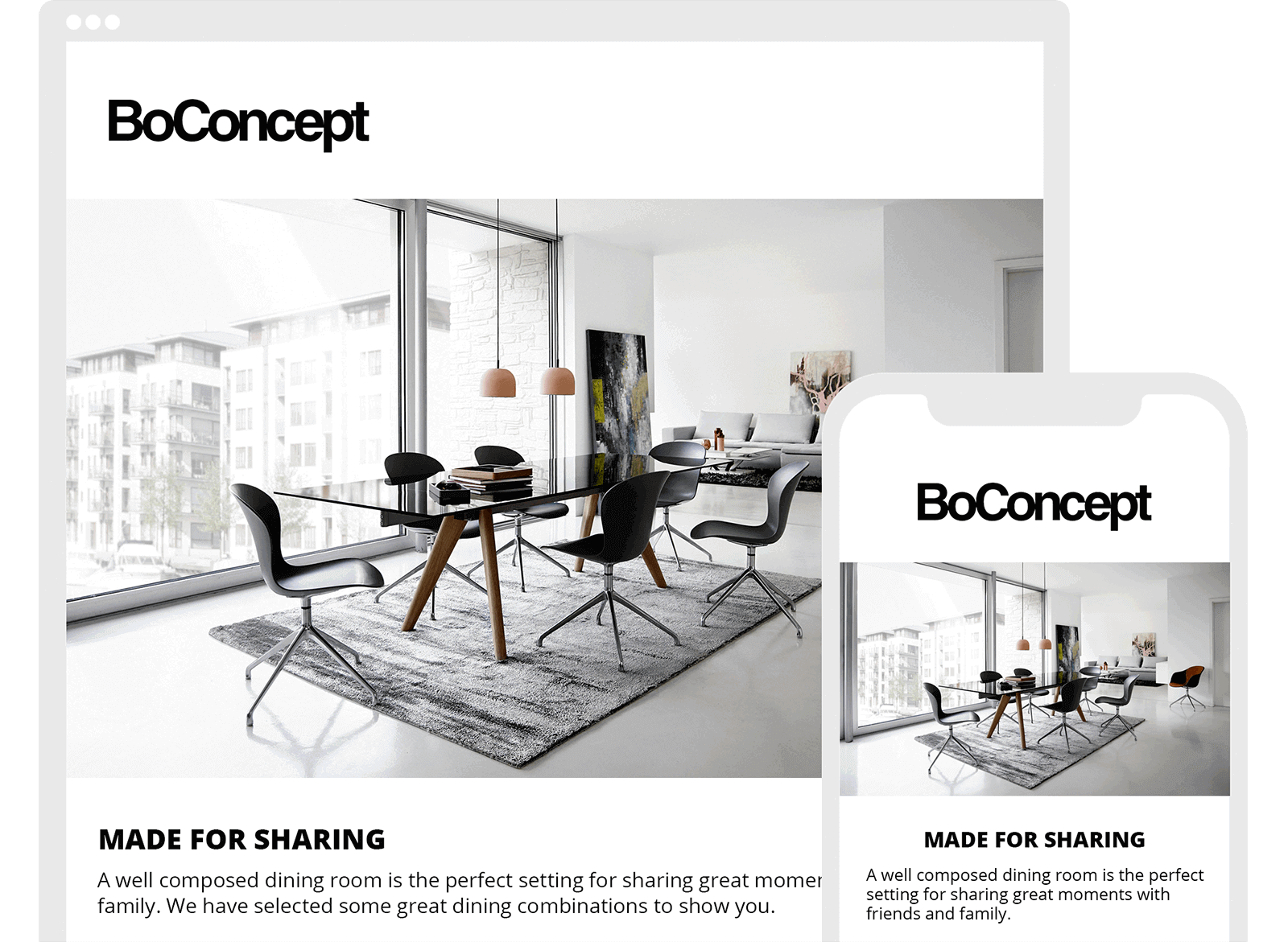
There are a myriad of mobile phones, operating systems and screen sizes. We have chosen to support iPhone perfectly, Android close to perfect (there are so many versions and various mail clients on Android) and Windows Phone, as well as Symbian, reasonably. And why not support all mobile types perfectly? The simple answer is that it is not possible. The various mail clients on the respective iPhone and Android alone interpret emails in very different ways. The Gmail client on the iPhone makes no mobile customization, while on Android it makes its very own form of mobile customization. The standard mail client, the blue icon, on the iPhone (the one we have used on the image above) makes a perfect scaling and mobile customization.
It is also possible to make your own modules responsive if your company wants modules that reflect your design manual 100%, the display on your website or webshop – or simply need a module that is not available by default among our more than 80 different modules. See a selection of the standard modules and their design below.
In admin interface, it is possible to adjust the degree of responsiveness. If your company wishes, for example, a larger font when reading on mobile devices or similar, it can easily be defined and changed without the need for assistance. A good rule of thumb is that 1.5x – 2x is the normal font size. If your normal paragraph style is for example, 12, 18-22 will be the right mobile font size.
Contact MarketingPlatform on +45 72 44 44 44 for a presentation of options. Or try our solution for free for 14 days.
Try MarketingPlatform for free for 14 days
The trial period is free, completely non-binding and expires after 14 days if you do not wish to continue.
Upon your subscription to our trial period, you will at the same time receive our educational flow on a series of emails – as well as our newsletter.